
How to Photograph Flowers with Accurate Color on Your iPhone: An Introductory Guide to Light, Settings, and Technique
Whether you’re shooting dahlias at golden hour or roses in full sun, the key to true-to-life flower photography isn’t necessarily your camera — it’s understanding light.
A Real-World Example: The Same Dahlia in Three Lights
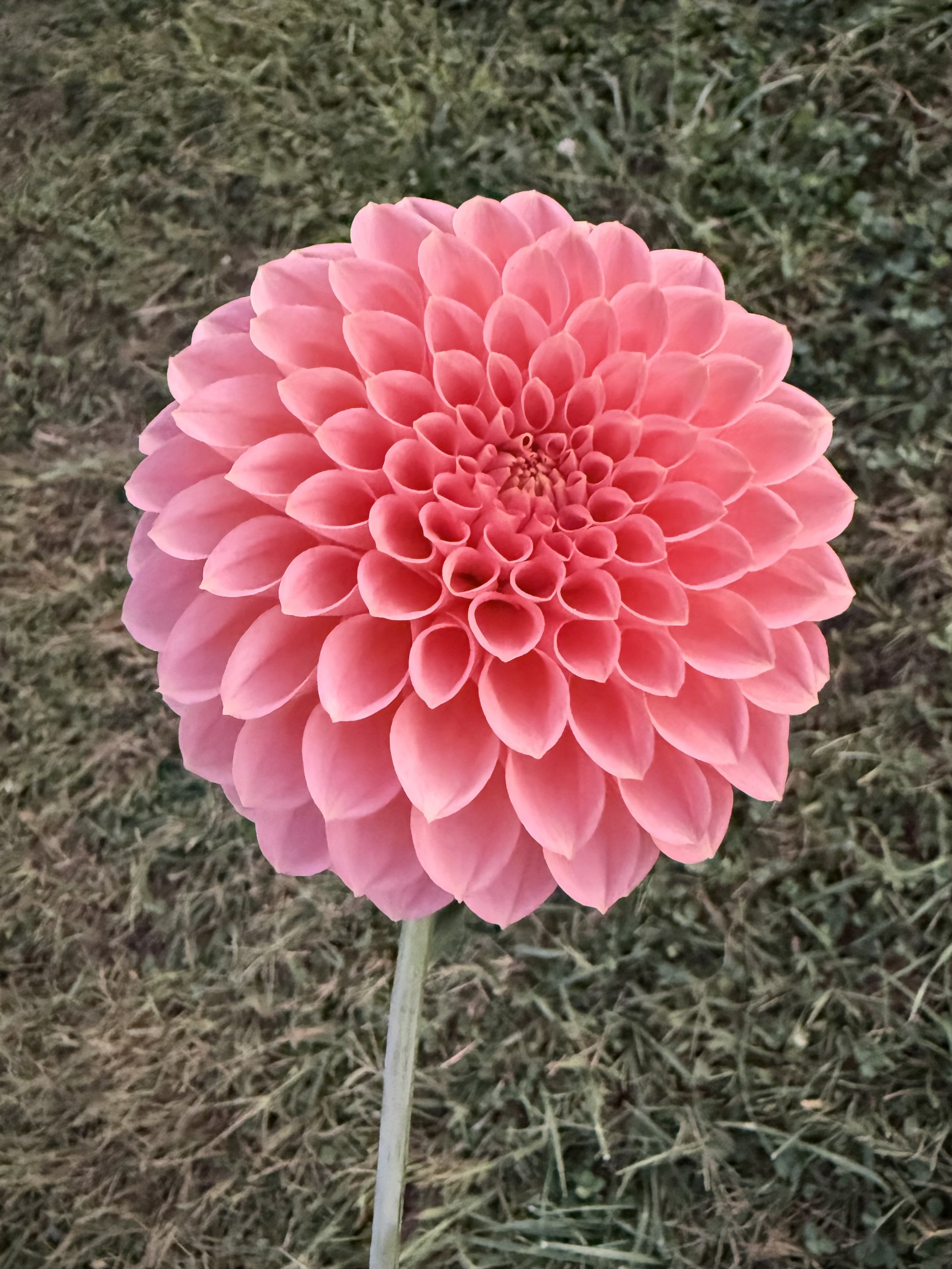
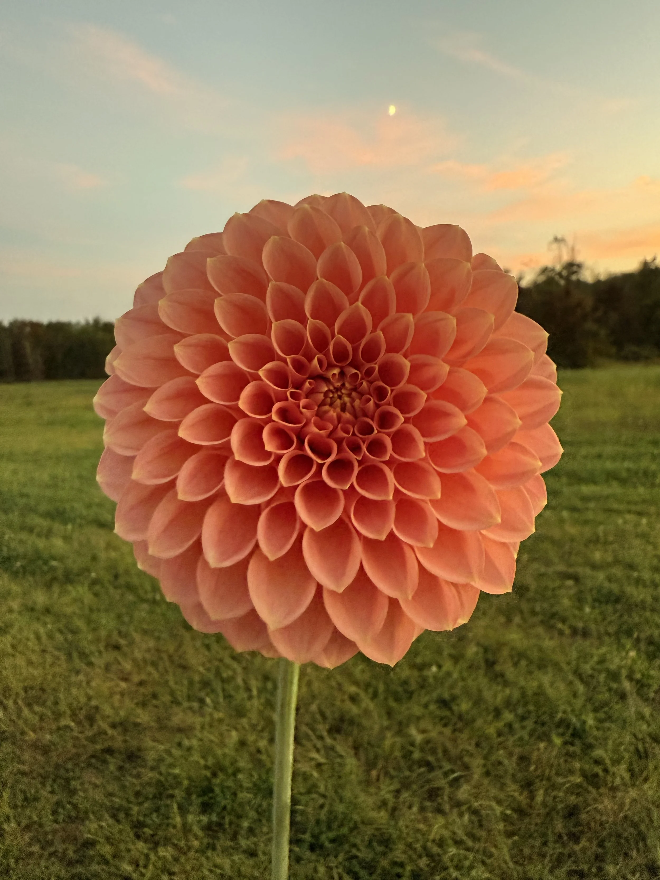
To illustrate how dramatically lighting affects perceived flower color, consider a coral-pink dahlia photographed three times.
At golden hour, facing away from the sun: The flower reads as a clear, bright pink — much closer to what the eye sees in person. Turned away from the direct sunset rays, the flower was lit by ambient sky light, which is cooler and more neutral than the warm golden light hitting it from the other direction.
At sunset in golden hour light: The flower glows as a warm, luminous orange, transformed by the sun’s warm cast into something quite different from its daytime appearance. (Note: the bright dot in background of this photo is the moon.)
In direct midday sun: The flower appears as a deeper coral-orange with rich, saturated tones and pronounced contrast between sunlit and shadowed petals.
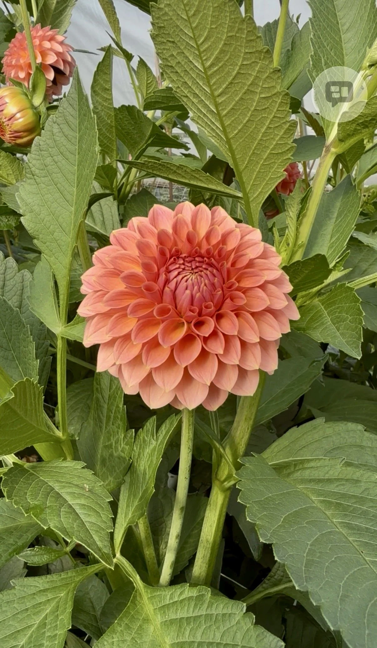
The pigment of the flower did not change in any of these photos. What changed was the quality and direction of light reaching the petals — and in each case, that light told a very different color story. Even two photos taken at the exact same moment can look dramatically different depending on which way the flower faces. This is why understanding light is so important in flower photography. The background also has an important effect on perceived color (see tip #6).
Why is it sometimes challenging to photograph flowers so the colors look true?
There’s a stunning bloom whose gorgeous colors you’re excited to capture, only to find that the photo doesn’t match what your eyes are seeing. The pink dahlia you photographed at sunset looks more orange. Or a soft coral color looks harsh, sharp and too bright.
The flower didn’t change. The light did — and light is everything in flower photography.
Accurate color representation is critical when creating materials to sell your floral work, whether that is a wholesale flower listing whose buyer (a designer/florist) must have colors that match their palette, a bouquet for a retail customer, or a mood board or mockup to present to a client.
This guide breaks down how different lighting conditions affect flower color, and gives a set of best practices for capturing blooms as accurately and beautifully as possible.
How Light Changes Flower Color: The Science Behind It
Understanding why flower colors shift in photos starts with understanding color temperature — the “warmth” or “coolness” of a light source (measured in Kelvin, which is also important for seed starting lights, but that’s another post).
Sunset and Golden Hour Light
When the sun approaches the horizon, its light must travel through a much greater thickness of atmosphere. This scatters away the blue wavelengths, leaving predominantly red, orange, and yellow light — the famous “golden hour” glow.
What is the result? Every subject, including flowers, takes on a warm orange cast. A pink dahlia photographed in golden hour light will appear coral or orange in photos, not because its pigment changed, but because the light itself is tinted. Your camera’s auto white balance often can’t fully compensate, and the warm cast bleeds through — especially on highly saturated subjects like flowers.
This is beautiful for mood and atmosphere, but it is not accurate color.
Midday Sun
At noon, sunlight travels through the least amount of atmosphere. The result is essentially full-spectrum, neutral light — no warm tint, no blue cast. Photos taken in direct midday sun often come closest to a flower’s “true” color.
However, midday sun creates its own challenges. It is harsh and directional, producing high contrast between sunlit petals and shadowed areas, blown highlights on bright petals, and deep shadows inside layered blooms (like dahlias or peonies) that obscure detail and make colors appear artificially dark and saturated in the shadowed zones.
Overcast and Shaded Light
Perhaps you have noticed this if your photo roll is full of flowers, but overcast days produce the best color accuracy. Cloud cover acts as a giant natural diffusion panel, spreading light evenly from all directions with no harsh shadows and a neutral color temperature. Colors appear most true, petals retain full detail, and there are no blown highlights.
Open shade — being out of direct sun but under an open sky — works similarly well.
Best Practices for Photographing Flowers with True Color
1. Choose the Right Time of Day
If color accuracy is your priority (and if your schedule allows!), shoot between roughly 9 and 11 AM. The light is still relatively neutral and soft, without the orange cast of golden hour or the harsh contrast of midday. This window is especially valuable on clear days when overcast conditions aren’t available.
Avoid shooting at sunset if you want your flower colors to look like they do in person — save golden hour for intentionally warm, atmospheric shots.
2. Prioritize Overcast Days and Open Shade
The soft, diffused light is ideal for flower photography: neutral color temperature, no harsh shadows, no blown highlights. If you’re shooting on a sunny day, move into open shade. The results will be noticeably more accurate and flattering.
3. Lock Your White Balance on Your iPhone
Auto white balance is one of the most common culprits behind inaccurate flower colors. Your iPhone constantly recalculates color temperature between shots, which can cause the same flower to look different across a series of images.
The native iPhone Camera app doesn’t offer a manual white balance control, so the workaround for this from what I’ve read is to use a third-party app which lets you set a fixed white balance (choose “Daylight” in sun, “Cloudy” on overcast days) and lock it for the session. Some apps I’ve heard good things about are Halide, ProCamera, or Camera+.
4. Shoot in ProRAW
If you have an iPhone 12 Pro or later, enable Apple ProRAW in Settings → Camera → Formats → Apple ProRAW. ProRAW files retain more color information than standard HEICs or JPEGs, and allow you to correct white balance without any quality loss.
On older iPhones that don’t support ProRAW, third-party apps like Halide or ProCamera can capture standard DNG RAW files, which offer the same flexibility.
RAW does take up more space on your iPhone.
5. Slightly Underexpose Bright Flowers
Pink, orange, red, and white flowers are particularly prone to overexposure — once those highlights blow out, all color information in those petals is gone and cannot be recovered.
On your iPhone, tap the flower to focus, then slide the sun icon that appears downward to reduce exposure. Pulling it down by a small amount protects the petal detail and color. It’s far easier to brighten a slightly dark image in post-processing than to recover blown-out highlights. This single step will noticeably improve your flower shots right away.
6. Heed Your Surroundings
Colors don’t exist in a vacuum. Any brightly colored surface near your flower — a red garden wall, green foliage in shade, a blue tarp — can bounce colored light onto the petals and subtly shift their color in your photo. Be aware of what surrounds your subject and, where possible, use a neutral or complementary background.
Notice the backgrounds in the first and second photos. Photo #2 is surrounded by a warm sunset sky, golden grass, and orange-pink clouds. The warm surroundings are physically bouncing orange-tinted light back onto the petals, shifting the color the iPhone actually captures. There is also a phenomenon called simultaneous contrast, which means the eye judges color relative to what surrounds it — a flower set against warm orange tones will read as more orange than the identical flower against a neutral background, even if the petals haven’t changed. It’s a meaningful reminder to pay attention to what’s behind your bloom, as well as the qualities of the light.
7. Use a Clip-On Circular Polarizing Filter
This I have not tried personally, but wanted to list as I came across it in my reading. A circular polarizing filter cuts surface glare and reflections off petals — glare that often masks the true color underneath — and deepens color saturation in a natural way. Clip-on polarizing filters designed for iPhone are relatively inexpensive (typically $20–$50) and make a noticeable difference on bright, sunny days. To use, rotate the filter until glare disappears from the petals and colors deepen.
8. Fine-Tune in Post-Processing
Even with optimal technique, a few small adjustments can bring a photo much closer to what your eye saw. iPhone-friendly options include Lightroom Mobile (free, excellent white balance and color tools), Darkroom (great for ProRAW files), and the native Photos app.
Final Thoughts
Accurate flower color on your iPhone comes down to three things: choosing the right light, managing white balance, and exposing carefully to protect petal detail.
The good news is that the best light for color-accurate flower photography — soft, overcast, diffused — is also the most forgiving and flattering for iPhone cameras, which can struggle with the harsh contrast of direct midday sun.
Most days the iPhone lives in my pocket while I run around the farm — no room for accessories, not much time for post-processing. What I’ve learned instead is simpler: find two or three spots on your property where the morning or late afternoon light falls just right, and return to them. Natural light, in the right conditions, is the only tool you’ll ever truly need. Taking photos with just interior lighting has always yielded (for me) unsatisfactory results; natural light, with the right characteristics, is truly superior.
I hope this information is helpful. Light and flowers are fleeting, memory is imperfect — but a well-taken photo preserves the true color and beauty of a bloom for every day to come.